At Work With: Peter Guzy, Asfour Guzy Architects

Peter Guzy is one half of Asfour Guzy Architects, the team behind some of New York’s most iconic restaurants. Our paths crossed at Misi, a contemporary Italian eatery in Williamsburg which opened to great acclaim late last year. Our Voronoi IIs light up the dining area, their spiral filaments suspended in space like slivers of spaghetti. Here, Peter shares insights from his incredible 20-years experience in the industry.
Since co-founding Asfour Guzy 20 years ago, you’ve built up a reputation for thoughtful, considered architecture, particularly in restaurant design. What came first: a love of food, or a passion for the trade?
The first thing was a love of architecture and its broad ability to influence the way we live and interact. A love of food was really discovered over a 10 year period during my 20s when I lived in Zurich – there I encountered people from all over Europe and the foods they made. Living in Switzerland also afforded me the possibility of travelling and, of course, eating. More than just a love of food, I developed an appreciation for how different people live and entertain, and embrace a culturally rich life in which food and enjoyment of food play a leading role.

How does your process in restaurant design differ to that of residential or commercial projects? What attracts you to it?
Every work of architecture should have a strong and identifiable narrative. Designing a restaurant or hotel requires an intensification of certain key design ideas to be explored. A restaurant, or hotel, is a public space that provides a specific service – such as serving food or providing shelter and a bed. Within these contexts, every experience one encounters helps define the narrative you have offered for the project. The five senses – taste, sight, smell, touch and sound – serve as key elements in the creation of spaces that are comfortable and well-tuned to the guest experience. The same issues that are present in most works of architecture – natural light, spatial creation, lighting, acoustics, material, color and textural interest – are heightened in a restaurant during the time one spends there. We are trying to create spaces that reflect a chef’s food and ideas about service and life in general. Each project seeks to create a sense of place that is unique to location, cuisine and experience.

What are some of the challenges you often face when designing dining spaces, and how do you overcome them?
Every work of architecture is rife with ample diverse challenges. The overriding objective is to eschew trends and empty decorative flourishes in place of creating a unique space that supports the ideas and mission of the restaurant timelessly. We are deeply pleased that many of our restaurants, some over 20 years old, have not been renovated and still serve their initial objective well.
For Misi, you created a subdued, minimal space with a sombre colour palette and rich textures. To what extent was this a response to the restaurant’s food offering – the flavours, the ingredients on the plate, the service?
Each project starts with the cuisine of the chef and an idea for how to create a sense of place that is aptly representative of that cuisine. A plate of food prepared by a chef serves as the DNA of who they are and from it we begin to understand their craft and nature. At Misi, the steel letters QB are embedded into the concrete reception table, which stands for quanto basta in Italian and translates to ‘as much as necessary’. This is chef Missy Robbins’ guiding principle for her cuisine and way of life. The cuisine of Misi uses few ingredients that are perfectly balanced and composed to allow the colors, textures and aromas to transcend the sum of their parts.
Quanta basta also served well as the design mantra for Misi. The design uses just a few materials and organizes the spaces around an open kitchen and dining counter, a bar, a glassed-in pasta room (and private dining room in the evening) around a central space inspired by the outdoor markets of Bologna, where Missy first learned to cook. The sense of place and intimacy of this market contrasts with the large urban scale of the Manhattan skyline, East River and the Williamsburg Bridge seen through the West facing windows. Using the market metaphor helps to create a convivial environment with a variety of experiences. The different elements around the market appear as exterior storefronts and stalls that are built with white Italian brick. The floor is made of gray encaustic tiles that seem like an exterior stone. Long custom lights evoke exterior street lights and the Tala mouth-blown bulbs appear as stars.

At which stage in the process did you turn your attention to lighting, and how do the Voronoi pendants suspended over the tables fit with your overall vision for the space?
The space for Misi was rendered in a simple manner using a just a few rich materials and rich textures. The stunning Voronoi fixtures provide critical qualities; a beautiful, handmade organic form that was in contrast with many of the other harder edged materials, and a low level of warm light that twinkled like randomly located stars in the sky.
Ideas for lighting really begin when the project first starts to take form – once we had established the general idea of the exterior market metaphor, the lighting scheme was contemplated. Good lighting works best when there are multiple sources of light – some indirect, some actual fixtures. At Misi, most of the light is indirect – the wash light on the ‘facades’ of the interior structures, the lights behind the work areas and from the hoods, and a series of very small recessed lights in the ceiling. We designed the long lights over the counter that were inspired by the type of lighting that is typically found on exterior facades, and there are some very simple sconces to provide some lighting at eye level, but the primary lighting element is the Tala fixtures. People always say they loved the pasta, but, as well, they often say they loved the lights!

In recent years, rising rents and lost leases have forced many of New York’s most loved restaurants to move or shutter for good. How do you design for an ever-evolving dining scene that offers no promises?
I think there are promises. We have been fortunate to work for some incredible chefs and owners. Great restaurants are constantly evolving while maintaining critical core principles. People return to places they enjoy and feel well taken care of. We design for these chefs.

Have you seen the relationship between architecture and food change since you started out? Is there anything that today’s spaces can learn from the city’s historic institutions, such as the Four Seasons, or any particular favourites?
I think chefs are always trying to help us find just the right mix of design ingredients. The Four Seasons is one of the best examples to learn from and study, even with the recent changes made there. The arrival from 53rd Street is quiet and serene. Transversing the staircase one ascends into the grill room – which is at once both magnificent and approachable – the more casual space. From there, one moves over the bridge passing through the epicenter of the Seagram Building, thereby establishing the context of the Four Seasons in this great building and the city beyond. After the bridge, one descends a few steps into the pool room – there is a great sense of arrival, having passed through a rich and precise architectural sequence that rivals the finest of the classical world. All of that before even being seated. The pool, around which all the seating is oriented, provides a unique respite from the city that looms outside the 20-foot-high glass walls. The sound of the water provides a perfect soundtrack for a wonderful evening.

Got a project on which you’d like to specify Tala? Get in touch with our team.
Shop the Voronoi II
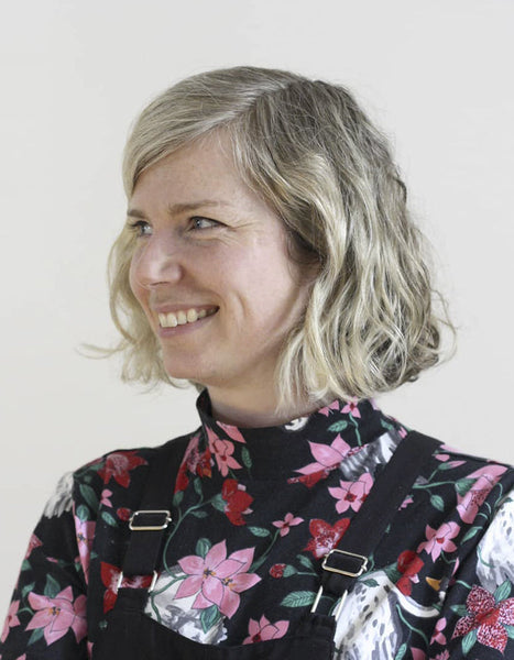
Headshot by: Francesca Giovanelli
Interior shots by: Eduard Hueber, Archphoto


